Our expert team can take care of it. Just click Get Expert Install and we'll send you an email when it's ready!
If everything looks okay to you, you can Ignore this warning.
Getting the best fine art or photo print requires you to download ICC profiles that match your printer/media. Whether you're a professional photographer or an artist, ICC profile downloads that are compatible with your printer are essential for getting the results you want.
Breathing color is well known as the go-to resource for those free ICC profiles and our expert color management team will make sure you get the most accurate ICC color profile download available.
If you are using a Breathing Color product and we don’t have your ICC profile download available, our color management team will happily create a custom ICC profile for you at no charge ensuring that your prints are of the highest quality possible.
If you are looking for custom Epson paper profiles or custom Canon ICC profile downloads, you can reach out to our color management team by clicking here for info about rates for custom ICC profile services.
An ICC profile downloads contains data that determines various color attributes from a device, in order to achieve accurate color reproduction. The data held in an ICC profile, whether it’s an Epson ICC profile download or a Cannon ICC profile, defines a mapping between the source (camera, image file) and the destination (monitor, printer).
Every device that outputs color or displays color is capable of having its own ICC profile. Since every device displays/outputs color differently, a standard was set by the International Color Consortium (ICC). With this standard, devices that are originally far from accurate can be profiled to match. And since each profile is specific to its device, it can be manually adjusted if necessary.
While there are many profiling devices out there, the industry standard is the Eye-One Pro. The Eye-One Pro is a spectrophotometer made by X-Rite, the leading provider in color management solutions. With the Eye-One Pro, you can profile computer monitors, projectors, cameras and inkjet printers. The Eye-One Pro can be used with different devices to make profiling easier to manage.
With the scanning ruler found in the i1 Photo Pro package, you can take all of your profiling equipment with you and use it anywhere. In house, the i1 Pro can be connected to the i1iO automated scanning table for faster, more consistent scanning. And to profile even faster and with little effort, the i1iSis has a spectrophotometer built in and even calibrates itself.
Although many printers use CMYK as their ink set (Cyan, Magenta, Yellow and Black), they can accept and print RGB images. An ICC profile downloads will produce the best results when the printer being profiled is in its best condition. All nozzles should be firing in a nozzle check; otherwise, the lack of nozzles can affect the output profile.
Also, setting the right media type is important as this determines the ink capacity a particular media will hold (explained below). If too much ink is printed on the media, the target swatches needed for profiling can become mottled and will make scanning accurately difficult.
If you're printing at home, you can choose between generic and customized paper profiles. Generic paper profiles are created and available for download from the paper manufacturer's website for a particular paper and printer model, whereas a custom paper profile is one that is made for a specific printer.
While most generic ICC profiles generated on another printer will work, in some cases this will not produce 100% accurate results. This is because every printer tends to “drift” from its factory standard over time. Most new printers out on the market today allow you to recalibrate/re-linearize your printer to bring it back to “home”, but older models don’t have this capability.
Custom ICC profiles are specific to your printer, ink and media you are printing on. This means that if your printer drifts over time, you can re-profile and get back the accurate color and consistency you originally started with. This also means that if you have multiple printers, you can profile each to get a match between them.
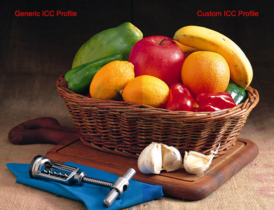
The example shows the difference between using a generic ICC profile vs a custom ICC profile specifically built on the printer being used. When looking at one on its own, the generic profile may seem acceptable. But upon closer examination, you will find that there is a slight magenta cast to the overall image. This contributes to the cutting board having a slightly unnatural look and causes the fruit to appear darker and over saturated than they really are, most notably the apple.
With a custom ICC profile (and a calibrated monitor), the image on the right accurately represents the fruit as they exist, as well as the cutting board appearing in its natural wood finish. At the end of the day, it is best to invest in a color management device that will enable you to manage your own color and output professionally.
The Eye-One Pro (X-Rite) has always been an industry standard, but the ColorMunki has proven to be an effective, low cost alternative to the Eye-One Pro. The ColorMunki is comparable to the Eye-One in terms of color accuracy but is even easier to use (especially for novices to color management).
Ultimately, if color output and consistency are important to you and your business, a color management device like the ColorMunki will ensure that you get just that. And since that will also cut down on the proofing process, you will cut down on waste/reprints and lower your overall cost. Not a bad investment.
It is essential to examine the ICC profiles' quality before using them. If your ICC profile download is low-quality, it is likely to produce poor results. When testing a new ICC profile download, you’ll want a good test image to use. A file that shows photos with many colors, flesh tones, black and white images, gradients, and solid black will show you everything you need to see.
The photo below is of a test file we use internally. The left side of this test image file was created by Onyx Graphics. Onyx is a leading RIP software provider that specializes in printing to multiple printers, consistent color management, and vibrant color. Their sample file is a great example of a test image that shows a wide variety of colors and tones.
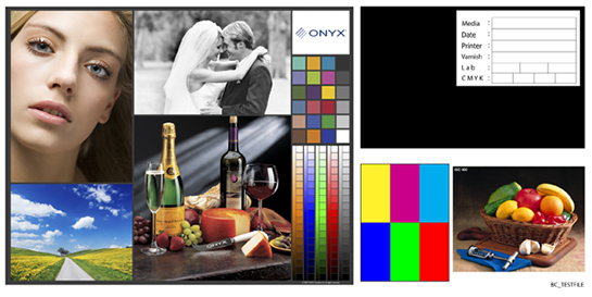
When viewing this printed image, it is important to look for the following:
On the right hand side, the solid black can be used to measure black ink density (dmax). You can use a densitometer for this measurement, or if you have a spectrophotometer (like the i1Pro) you can use the included software to measure black ink densities. You can also soft proof the test file on your monitor to check color accuracy (be sure to calibrate your monitor prior to doing this test).
To download and install our ICC profiles, please watch the step-by-step video below. This video shows the process for PC and Mac users and will guide you through the location of our profiles and the location where they need to be installed.
Now that you have downloaded our ICC profiles and installed them to your drive, you are ready to print. The print settings and visual layout of the software will vary by printer model, computer operating system, and printing software.
In the below video, we've used both a Mac and a PC to show you how to print on both a Canon iPF8400 and an Epson Stylus Pro 9900. It is important to note that the example in the video is for our Lyve canvas, so certain products will have slightly different settings. Visit our ICC Profiles and Print Instructions page for a step-by-step walkthrough on getting AMAZING prints.
Here at Breathing Color, we take great care in creating the best possible profiles for our canvas, fine art paper, and photo paper. Extensive testing and evaluation go into each ICC profile download before we offer it on our site. If we don't already have the ICC profile download you require, get in touch with us and we'll make one for you so you can produce work you're proud of. Visit our ICC Profiles and Print Instructions page for a step-by-step walkthrough on getting AMAZING prints.
Contact us if you run into any issues or have any questions at all.
So why do we want to consider color management when printing, anyway? The answer to that question is simple: proper color managment (and high-quality paper) will lead to great prints that match what you see on your computer screen. There are three methods you can use to manage your color when printing. Below, we've included detailed steps for each of these three methods, and in which cases we recommend each.
This method is most commonly recommended for the average to intermediate printmaker. In order to download and print with Breathing Color profiles, visit our ICC Profiles and Print Instructions page for a step-by-step walkthrough on getting AMAZING prints.
These settings are recommended for non-advanced printmakers who are not familiar with the more technical option of using ICC profiles. If you want to have great results without having to install or use ICC profiles, these settings will help get you there. The settings outlined in the video below are aimed at pleasing color with high saturation.
Creating a paper profile that is specific to your printer in its environment is the best way to ensure most predictable color. Here we will talk about many best practices to follow when creating these custom profiles. We'll cover how to select the right media type for maximum density and ink saturation, the correct way to print and scan profile targets, and some of your hardware and software options. Lastly, we'll recommend some ways to make a print and evaluate the profile once it is built. Read on for a brief description on the differences between a custom ICC and a generic ICC profile, how to manage embedded profiles, and so much more!
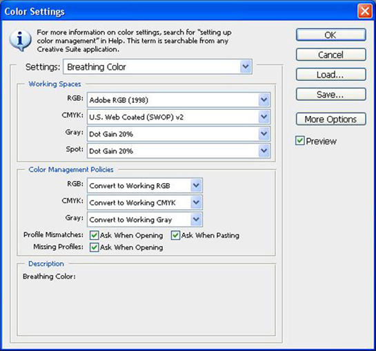
To access your color settings in Photoshop, click on the Edit pull-down menu and locate Color Settings near the bottom of the list. Your working space specifies the color profile that is to be used for either a CMYK or RGB workflow. The profiles you choose as your working space can be whatever you specify as there is no right or wrong setting.
The most commonly used working spaces are Adobe RGB (1998) and U.S. Web Coated (SWOP) v2. These are selected due to their relatively wide color gamut and consistency with the vast majority of reproducible colors. Looking in the bottom portion of the window you will find the Color Management Policies. These policies determine what action Photoshop takes when you have files that have a different embedded profile to what your working space is set at. Normally, these settings are set to “Preserve Embedded Profiles” but changing that to “Convert to Working” will keep all of your files in the same color space. This is important if color consistency is what you strive for.
Last but not least, Profile Mismatches and Missing Profiles should be “checked” to activate “Ask When Opening”. This way, any time you open a new file you will be notified if the file you are opening is embedded with a profile other than your working space. It is always best to convert to your working space.
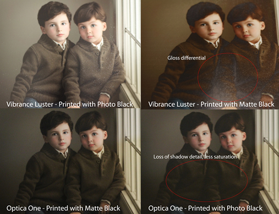
Now that you have your color settings complete, let’s go through the process of creating a custom ICC Profile. These settings are universal regardless of the device being used for profiling. In the following example, we will be profiling on the Epson Stylus Pro 9900. The 9900 is equipped with Matte Black and Photo Black, and it is very important to use the black that best suites the media you are printing on.
Photo Black is used for any photo papers that have a gloss, satin, or luster sheen. But Photo Black is also used on glossy canvases, such as our Crystalline Gloss or Satin Canvas. Photo Black has sheen to it so printing with it on the media types mentioned will produce blacks that match the sheen of the paper. If you were to use Matte Black on a photo paper, you will experience gloss differential in the blacks or any colors that are combined with black. Gloss differential (not to be confused with bronzing) mainly happens with black since the black inks in the 9900 have very different properties.
Using Photo Black on a matte paper will result in the image looking somewhat washed out and less vibrant. On the flip side, using Matte Black on a photo paper will have a noticeably dull look in any dark areas due to the Matte Black’s dense properties and lack of sheen. Please see the images below to have a better understanding of what this looks like. Switching Photo Black to Matte Black uses about 1.13ml of ink and Matte Black to Photo Black uses about 3.34ml of ink. This is because the black inks share a line in the ink delivery system so the ink currently in the line is purged to allow the opposite ink to be used (On the 9900). The entire process takes about 2-3 minutes.
Before you do any printing, be sure to run a nozzle check on your printer and make sure that you have no clogged nozzles. Printing a target without "all systems go" can introduce some unnecessary complications down the line, and potentially cause a lot of your time to be wasted.
Next, open your profiling software (i1Profiler, ColorMunki Photo, ArgyllCMS, MonacoProfiler, etc...). Most profiling software will have a step-by-step profiling process that will begin with printing the profile patch target that will need to be scanned in using your device. We will be citing examples of i1Profiler and ColorMunki Photo software throughout this article.
Once you get to this target printing stage, you will need to set the printer settings and send the target file to your printer. The settings that you select are extremely important and can vary depending on which type of media you are creating the profile for. "So which settings do I use?!" you ask? You can often contact your media provider for recommendations, but often this will require some trial and error; especially when determining which media type setting to select. (If you use Breathing Color canvas or paper, give us a call and we'd be happy to help out.) Below, we'll discuss some of these different print settings and how to go about determining the best for your situation.
Your printer has a lot of standard media types that are used for printing. Many people wonder what the correct setting is for a particular media. The short answer is to match the media type in the driver with what most closely resembles the media you are printing on. But sometimes you can achieve better results through experimentation.
The media types in the Epson driver have set ink loads that will differ depending on what you are printing on. Canvas, for example, can absorb more ink than a typical photo paper so it’s important to use a media type that outputs more ink. If you do not utilize the maximum capability of your media, the prints can appear washed out and dull. However, outputting more ink than the media can handle will result in over-saturation, mottling, pooling, ink bleeding, and lack of sharpness in the overall print.
To find the right balance, it’s best to do a small test print and visually check if any of these instances occur. Check out Scott Martin's Onsight Media Selction Image along with his great article on how to determine the optimal media selection for your printer. For Breathing Color Lyve Canvas, for example, the "Canvas" media type setting typically produces just the right amount of ink to push the output and color gamut to its threshold without any problems. Depending on your print room temperature/humidity, your results may vary slightly so it is best to test multiple media types before determining which is best to use. As long as you do not see any of the artifacts described above and the color looks vibrant, you are ready to proceed.
The Print Quality is best determined by what media you are printing on. Under Quality Options, you will find various resolution/print modes. 1440x720dpi offers great resolution without sacrificing speed when printing on canvas. 2880x1440dpi may be considered “over-the-top” since you will not notice additional resolution sharpness on canvas due to its texture and porous look. 2880 will also slow your printer down considerably and use slightly more ink overall. However, if you are running high res photos 2880 will give you a noticeably sharper results in the shadows and detailed areas of your image.
Of course, these resolution settings are moot if the file you are printing is relatively low in pixel depth (also referred to as low resolution). High Speed mode should be left on as this utilizes bi-directional printing (print head fires ink in both directions of travel). If you are not sure how a particular image will print, click on the View menu and select Actual Pixels in Photoshop. This will accurately show the resolution of your image at 100% (the size the image will be printed at). While canvas tends to be more forgiving in terms of output (in regards to a low resolution file), a typical photo paper will not be as forgiving.
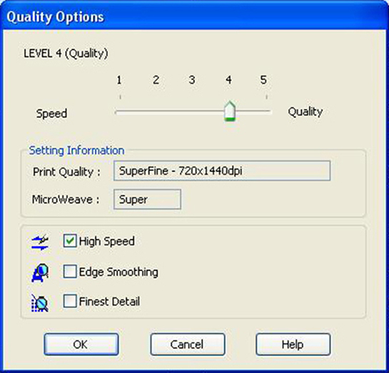
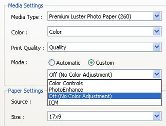
Below Print Quality, you have a Color Mode. When set to Automatic, the Epson driver will apply a color mode to the print. Usually this will raise the overall saturation of the image being printed, especially in the Reds and Blues. This should not be applied to building a profile due to color shifts that may occur. These settings can be experimented with during the printing process, but for profiling they should be turned off.
To do so, change the Color Mode from Automatic to Custom. When Custom has been selected, click on the pull-down menu below and select Off (No Color Adjustment). This will leave the target file unaffected. Now that all of these settings have been made, you are ready to print out the targets for profiling.
When the targets have been printed, allow them to dry for at least an hour minutes prior to scanning with your spectrophotometer (give it 24 hours, if you can wait).
Something as simple as the profile name may not immediately seem important, but get a few profiles saved and confusion can quickly set in when switching between different papers. It's best to adopt a standard nomenclature that you use across all of your profiles. Take our Breathing Color profiles as an example: BC_Lyve_9900_MK_Canvas. Here you can see that we label it as a Breathing Color profile with BC. Then we tell you which BC media it's for - Lyve. Then the printer model it's for - Epson 9900. The MK signifies that matte black was used to print the target. Finally, "Canvas" tells you that it was printed with the Canvas media type setting. You could go into more or less detail in your own naming convention if you wanted, but this is a great starting point.
What I do next is print out an evaluation image. This image should have a wide range of image types to help show how well your printer profile is made. You should find a great image and use that same one for each new media that you profile. This way you can maintain consistancy, and eventually spot irregularities very quickly because you will be so used to how the image should look. Scott Martin's Onsight Color Evaluation Image is a great example of a great evaluation image. The PSD file even contains some text fields so you can add your media type, date, etc... allowing you to keep track of everything.
You want to use the same settings (media type, print quality, mode, etc...) when printing your images as you did to print out your profiling target. Only this time, you will of course associate your new target with the print in the printing program of your choice.
Have questions? Email us. We are more than happy to help, or at least get you pointed in the right directon.
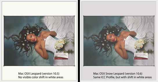
Many users have run into a profiling problem when upgrading their Mac’s to OS 10.6 (Snow Leopard). Apple computer’s API (Application Programming Interface) for color management is ColorSync. This application not only holds all of your monitor ICC profiles, generic printer ICC profiles, and custom ICC profiles; it controls how those profiles are used and output to the various devices they are for.
Unfortunately, upon upgrading Snow Leopard from your existing version of OSX, a ColorSync “bug” is introduced to the system. While some of your current profiles will be unaffected, you may come across certain profiles you have successfully used in the past to now have a noticeable color shift. This is most common in the white areas of the print. They tend to print as a light gray cast, and can vary depending on the white point in the image file. One solution to this is to have your profile calculated using version 2 ICC specification. This is an older calculation that will not be affected by the ColorSync bug in OS 10.6.
If you are certain that you have a version 2 ICC profile, then you will need to have a new ICC profile created. Whether you have your own device, or are printing targets to send to us for profile creation, you’ll want to follow the steps below:
Open the profile targets in Photoshop
Edit > Assign Profile > Adobe RGB. Click OK
File > Print
Set Color Handling = Photoshop Manages Colors
Set Printer Profile = Adobe RGB
Set Rendering Intent = Perceptual
Uncheck Black Point Compensation
*You do not have to pick Adobe RGB as the profile. You can use whichever profile you prefer, as long as the embedded profile (step 2 above, which assigns an embedded profile) matches the printer profile.
This seems counterintuitive, but it works because you are matching the embedded ICC profile of the targets with the printer profile. In other words, there will be no color shift when the targets get printed. Beyond that, the rest of the driver settings should remain the same. This will allow the targets to be printed the same way they are when you print using “No Color Management”. When printing your image with the new profile you’ve created, just use the profile under the Printer Profile setting in the driver. It does not need to be embedded in the Photoshop dialog prior to printing.
To learn about the basics of color, ideal viewing conditions, calibrating your computer monitors, or building a profile for your camera, take a look at the informative videos below:
Breathing Color paper and canvas is compatible with just about any printer that uses pigment or dye-based inks. We also make paper and canvas that works with solvent, UV and latex ink! If you're not sure, just give us a call - 1.866.722.6567 - and we would be happy to help. The below list is a compilation of commonly-used printer models. If you don't see yours listed, give us a call!
Click here to download Breathing Color's ICC profiles and view our simple, step-by-step print instructions for your specific printer. You won't find this type of tool anywhere else! We are experts in printing and all things color management-related, so contact us with any questions you may have.
Professional Photo – Pixma Pro-1, Pixma Pro-10, Pixma Pro9500, Pixma Pro9500 Mark II
Large Format – iPF5000, iPF5100, iPF6000S, iPF6100, iPF6300, iPF6300S, iPF6350, iPF6400, iPF6450, iPF8000, iPF8000S, iPF8300, iPF8300S, iPF8400, iPF9000, iPF9100, iPF9400, iPF9400S, W6400, i990
Stylus Photo Series – R1800, R1900, R2000, R2400, R2880, R3000
Stylus Pro Series – 3800, 3880, 3890, 4000, 4800, 4880, 4900, 7500, 7600, 7800, 7880, 7890, 7900, 9500, 9600, 9800, 9880, 9890, 9900, 10000, 10600, 11880
Hi-Fi Jet Pro & Pro II Series Printers
DesignJet – Z2100, Z3100, Z3200, Z3200ps, 5000, Z5200, 5500, Z6100, Z6200
Photosmart Pro – 8750, B9180
JV-4, JV2-130, JV22-160
RJ46, RJ50, RJ62, RJ64, RJ900, Falcon II, Toucan LT, ValueJet 1304W, ValueJet1604AW, ValueJet1638W


