Breathing Color is now publishing measured testing data analysis of our products in order to illustrate our ongoing commitment to excellence in quality and the attainment of clear leadership in product innovation. We call our products "the most advanced in the world" - and its our job to to show you precisely why.
Our analysis follows print quality evaluation standards set forth by the ISO (International Standards Organization). The ISO is an international organization responsible for developing and maintaining technical standards, and it is vitally important to understand that these specific print quality attributes are defined under ISO 13660. The ISO developed ISO 13660 as the international standard for print quality evaluation.
By precisely following this ISO standard we are able to objectively evaluate a range of inkjet fine art papers. Objective print quality analysis uses instruments to assess the characteristics and attributes that make up a print and impact the perception of print quality, as opposed to a visual assessment which is inherently subjective. While a subjective visual assessment can be useful, different observers may return different results based upon opinion - not fact. On the other hand, objective print quality analysis is repeatable and is not dependent on the operator or inspector. Instead, our analysis will compare our products to other comparable mainstream products with solid numerical measurements in specific print quality attributes such as Visual Optical Density, Tone Reproduction (Graininess), Tonal Range, Mottling, Brightness, Line Quality (Blurriness), and Line Optical Density. Note that these are all attributes set forth by ISO 13660.
In order to maintain consistency in the testing according to the ISO standard, every inkjet fine art paper in this evaluation was printed using the same image file on an Epson 9800 with K3 matte black Inks, using no icc profile (in Photoshop CS2, you would select "No Color Management" for the Color Handling setting), using the "watercolor radiant white" as the paper setting, 1440 dpi resolution, and high speed off.
It is important to note that while a custom icc profile and perhaps differing media settings might lift the visual optical density of the products, the purpose of this testing is to keep all factors constant in order to achieve an "apples to apples" comparison. Therefore, the numbers seen below should not be considered a definitive measurement of any attribute but rather a means of objective attribute comparison.
Our Product: Elegance Velvet Platinum Edition
Mainstream Competitive Products:
Hahnemuhle Photo Rag
Somerset Velvet
Somerset Textured
Arches Infinity Smooth
Arches Infinity Textured
Museo Max
Museo
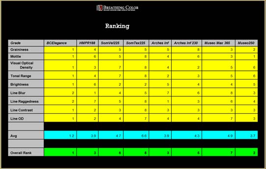
Why is Elegance Velvet Platinum Edition the most advanced 100% cotton rag fine art paper in the world? Because when a print quality evaluation is performed according to ISO 13660, and Elegance Velvet Platinum Edition is compared side by side with comparable papers, it clearly and objectively dominates in overall print quality performance. We will demonstrate this below.
At Breathing Color, we want our customers to know just how much care, quality, concern we put into every specific attribute of the paper or canvas before we release it into the marketplace. Our logic is that the total impact of the many print quality attributes is what ultimately determines how we perceive the overall quality of a given printed image. Creating a product that dominates the categories is essential; it assures us that our product will provide a significant advantage to the marketplace. Developing leadership products is a painstaking process that not only requires significant investment in time and money, but also a passionate devotion to the endless pursuit of finer print quality.
This is the essence of Breathing Color. Through our truly innovative products, we hope to deliver a Love at First Sight™ experience to everyone.
The Evaluation:
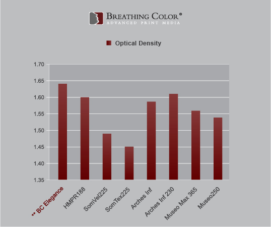
Visual Optical Density
Optical Density, also known as Dynamic Range, quantifies the level of shadow detail and mid-range gray values and is therefore an extremely influential factor of overal image quality. It is therefore critical in establishing the tonal range of the inkjet fine art paper. Optical density can also be a function of how deeply the inkjet ink penetrates into the paper.
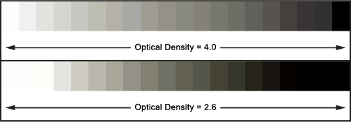
The average darkness of the printed area as defined by ISO 13660. The total tonal measurement is on a scale of 0.0 (white) to 4.0 (black). For example, an Optical Density of 3.8 to 4.0 would represent 95% to 100% of the original source's tonal range.
See the following example below which demonstrates that a lower optical density limits the total tonal range.
Therefore, to maximize the tonal range, it is optimal for an inkjet fine art paper to have the highest optical density possible. Please note that the following readings are using a visual density standard with a grey filter:
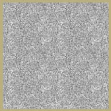
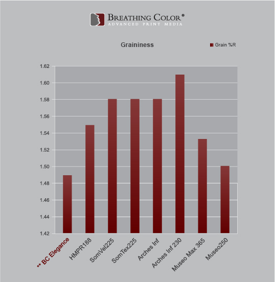
Tone Reproduction (Graininess)
Graininess can be described as aperiodic fluctuations of density at a spacial fequency greater than 0.4 cycles per millimetre in all directions. ISO Graininess is based on density variation and therefore considers both the magnitude of the variation in the print and the mean reflectance level of the print. ISO Graininess is intended primarily to evaluate graininess in high quality image reproduction such as photography and fine art. A higher level of graininess cheapens the printed image. Here is an example of graininess:
The objective of the tone reproduction analysis is to evaluate the variations of density, tone color, and image noise as the ink interacts with the substrate. These variations are important in studying a paper’s ability to reproduce images and are critical to producing image qualities such as fine details in highlights and shadow regions of an image.
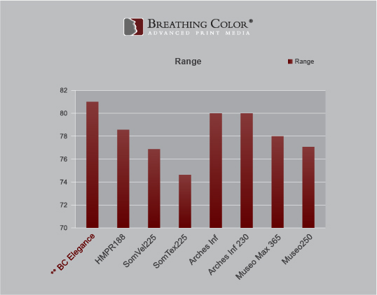
Tonal Range
The Tonal Range of a digital image is the number of tones it has to describe the Optical Density, or the Dynamic Range. It is the numeric difference between the image's maximum highlight and its minimum shadow. Many experts argue that improving the tonal range of an image is the first step that should be taken in almost any effort to enhance a photograph.
It is important to note that an image with a high Optical Density can have a narrow tonal range, and vice versa. Therefore, optical density alone cannot summarize the tonal range that a particular inkjet fine art paper delivers.
Generally, having a full tonal range is desired because it means that the image has, in a general sense, the fullest possible contrast (unless of course you are working with an entirely white image). Therefore, images that are printed on papers that limit the tonal range will look more muddy and washed out in comparison to others.
Tonal Range is calculated by subtracting the Luminance value of 100% black from the Luminance value of the base white sheet. The wider the range of this number the more accurate the substrate will perform in reproducing images.
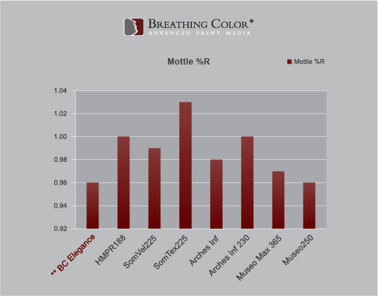
Mottling
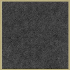
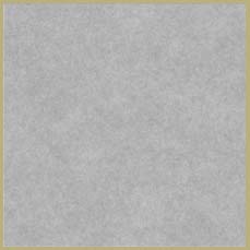
Print Mottling can be defined as undesired unevenness in perceived print density (unwanted reflectance variation patterns) that make the interpretation of the printed information more difficult for the Human Visual System (HVS). The human eye detects print mottling as non-uniform distribution of colors and shades. Print Mottling is considered one of the most detrimental factors to overall print quality and is therefore critical to evaluate in a proper manner. Here is an example of mottling in both gray and black areas:
In this study, non-uniformity at a spatial scale of smaller than 250 um is not included. The units of mottle are percent reflectance using visual density standard. A smaller number reflects less mottle.
Brightness
The brighter and whiter the paper, the brighter and lighter the images. Photos appear brighter and colors clearer on inkjet photo papers with higher paper brightness ratings. With matte finish papers, a higher paper brightness can make a greater difference than it does among gloss finish papers of varying paper brightness.
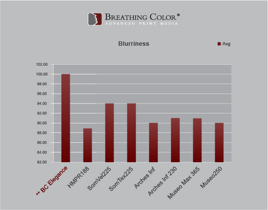
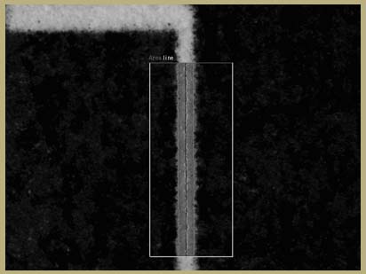
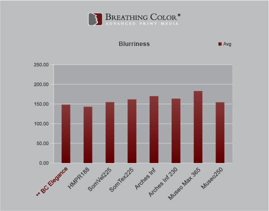
Line Quality (Blurriness)
The line is a basic geometric shape fundamental to all images. The most desirable characteristics of lines influence all aspects of the image and include line density, sharpness, stroke width and edge quality. A crisper, more defined line will produce a crisper, more defined printed image. Here you can see how line quality analysis is useful in determining overall quality of a printed image:
Blurriness is the appearance of being hazy or indistinct in outline. The measure of blurriness corresponds to the width of the transition zone between field and line. Blurriness increases with line width. Here are our measurements:
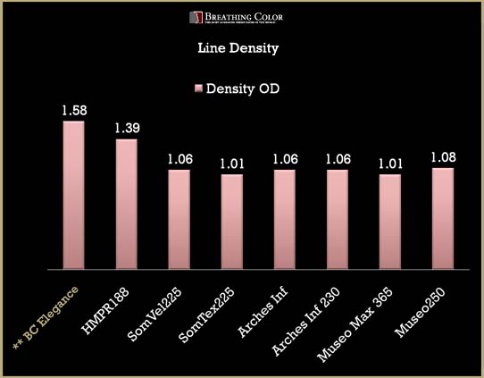
Line Optical Density
The darkness of a line as defined by ISO 13660. Line density takes into account wicking functions of the media (i.e wicking results in a drop in line optical density). Line optical density is important because although an inkjet fine art paper might be able to deliver a high optical density, this does not mean that it will also deliver a high line optical density. A lower measurement in line optical density will result in a printed image that will not have as much contrast, and will appear less clear.
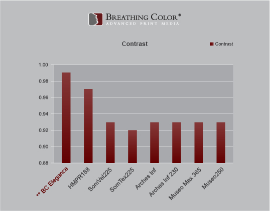
Line Contrast
Line contrast is the relationship of the darkness of a line and its field. It is a function of the whiteness of the substrate and the density of the line. Higher contrast results in more defined images.
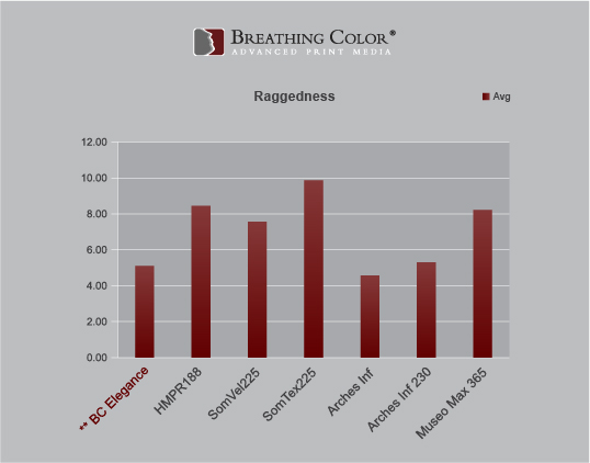
Raggedness
Raggedness is the appearance of geometric distortion of an edge from its ideal position. A ragged edge appears disjointed, or rough and wavy, rather than smooth or straight. It is measured as the standard of the residuals from a line fitted to the edge threshold of the line under study, calculated perpendicular to the fitted line. It is also independent of line width.