

Learn how to utilize Photoshop typography to create stunning images by effectively pairing text and photos together.
Photoshop recently added a Glyphs Panel to its typesetting tools. Type geeks rejoiced; others said “Huh?” or other uncouth grunts.
Here’s why this is important news.
Many people use Photoshop for type setting, because that’s the only program they have that lets them set type and images together.
Adobe has responded by adding features and support for professional quality type settings in Photoshop.
Taking advantage of the type tools in Photoshop makes you (and your type) look very professional.

Glyphs are the individual characters that make up a font.
In addition to the characters we access using various keys in combinations on our keyboards, fonts have many more characters (some have thousands) and the Glyphs palette lets you find and use them quickly and easily.
You can add variations on a character you’d like to jazz up (such as the alternate letters shown in the Glyphs panel screen capture), find ligatures (a hallmark of great typesetting), use correctly-formatted fractions in your text (3/4 is not correctly formatted), or add decorative characters (such as leaves, starbursts, and all sorts of other designs and devices).

When bad type is paired with great photos, the image loses so much value.
If you don’t master the type tools in the program to look as good as possible, you may find some people don’t even see your images, because the type makes them cringe.
I say this because friends have shown me various image and text combinations recently which they created in Photoshop, and some of them were truly wince-worthy.
So, here’s the first post about successfully and elegantly using type in Photoshop, with some simple tips that are easy to use, with the reasons to use them. More will follow over time.
Tip #1: Turn On Smart Quotes
Preferences → Type: Select First Checkbox.
It may be on; if it’s not, turn it on. Why?
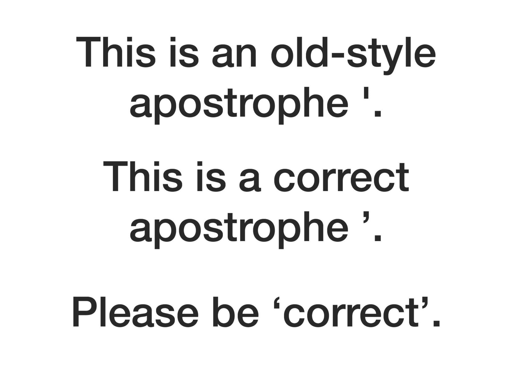
Smart quotes curve toward the letters. Quotes at the front curve to the right, toward the first word; quotes at the end of the quote curve to the left, toward the last word.
Smart quotes will also make apostrophes curve, instead of using the all-purpose, straight up and down mark that doesn’t curve.
When we typed on typewriters, we only had one key for apostrophes and quotes, so we had to use the same, straight up and down mark for opening and closing apostrophes.
Adding the Shift key on a typewriter keyboard let us type straight up and down quotation marks.
We don’t need to do this anymore, and straight up-and-down quotes and apostrophes are a sure sign of less-than-professional type.
One type-loving friend shudders when seeing straight quotes and describes them as “using the wrong fork to pick your nose at the dinner table—wrong on so many levels!”
Tip #2: Discover The Five Photoshop Panels Dealing With Type

These controls will open up all the power of Photoshop’s typesetting to you.
Type → Panels → (then choose) Character, Paragraph, Glyphs, Character Styles, or Paragraph Styles.
I’ll discuss them in detail further in the the next post, but in this post, we’ll use the Character Panel first to set a firm foundation.
Open it and leave it open to use with the next tip.
Tip #3: Using All Capital Letters Is Usually BAD

When you set type in ALL CAPS, it’s the typesetting equivalent of SHOUTING at someone. Why would you do THAT?
An elegant alternative is to use Small Caps. This preserves a distinction between capitalized first letters and the rest of the line.
Research shows that All Caps is harder to read than almost any other way to set type, so if you want people to actually read what you so carefully typed to place on or under your image, making it as legible and attractive as possible seems like a good plan.
To demonstrate, here’s a caption that will go under a family portrait at their request. The name and date are set with capital and small letters first, rather than All Caps.

To make small caps in Photoshop, type the text you want to set. Then, select it, and open the Type Panel using the path shown in Tip #2. This panel will appear.
Click on the icon for Small Caps, shown in the screen capture with a rollover tool tip. The icon is a capital T followed by a smaller-sized Capital T.
Any lower-case type selected will be converted to scaled down capital letters; any type already typed in capital letters will remain a full-sized capital.
If you’d like to show off your typesetting erudition, search in TypeKit for a font with already-drawn Small Caps, such as the font shown here, Niveau Grotesk.
Small Caps are available already drawn, in multiple weights, in this font.
Pre-drawn Small Caps are almost always more visually appealing when compared to Photoshop-generated Small Caps, because the weights are better balanced.
You can see this in the screen capture of the caption changed to Small Caps. It doesn’t look bad, but it can look better.
Tip #4: Use Spaces Correctly (And Sparingly)

Do not put two spaces after a period and before the next word, unless you are trying to make your type look as ugly as most typewriters made your type appear.
This is an unfortunate reflexive hangover from when we all used typewriters.
It was considered necessary to add an extra space to make enough visual space between the end of one sentence and the next, because the spacing between all the letters was the same.
We don’t use monospaced fonts for the bulk of our work, and that style of font is perhaps the only reason to use two spaces.
It’s a dead giveaway that you’re not setting professional quality type.
Tip #5: Pick Good Fonts (Less Is More)

We all know people who love to use every font on their computer, often in one document. This is too much of a good thing.
To best complement your photos, know and use various font extended families, which extend visual variations without going overboard.
For example, in the sample shown below, the font family Myriad Pro includes multiple variations, including different weights, from Light to Black, and different widths, from Condensed through Regular to SemiExtended/Extended.
A font super family such as this has multiple weights, and multiple styles.
A good rule when setting a document is to pick no more than two font families to use for the majority of your type, one for the body text, and perhaps a one for subheads.
Perhaps (and only perhaps), you might pick a third font, such as a decorative font, just for a headline or other accent, where it can be set in a size large enough to insure its legibility.
Photoshop includes access to the TypeKit, Adobe’s online source for multiple font families included in your Creative Cloud subscription, or in your Photography Bundle subscription.
You can use the TypeKit’s online browser to find the style of fonts you want, then check for how many fonts are inched in that particular design.
In the screen capture above, the leftmost font (Eloquent JF) has only 4, while Skolar Sans, at right, has 72.
Both have their uses, but when looking to add variations while keeping consistency, a large font family provides more useful and elegant options.
You can search by style, with multiple options to find just the fonts you want to complement your images.
Tip #6: Use Text Boxes To Hold Text

Draw a text box with the Text tool (T) to hold your type, rather than clicking and starting to type. Why?
Text boxes can hold all the type you want to put in a single area, or for an entire page.
When I receive a Photoshop file from certain clients for editing, I shudder, because they sometimes will have as many as 85–90 layers of type, each one a few words or a single line.
If the type needs any editing, I end up spending a lot of time combining all these itty-bitty pieces into blocks of type, which can then be properly aligned, tabbed, styled and edited as needed.
People who refuse to learn how to use text boxes because “that’s too complicated” remind me of people who refused to take 20 seconds to dust their negatives in the darkroom but would routinely then spend hours with a brush and dye filling in dust spots on batches of prints.
Life is too short to work that hard.
To draw a text box that fills an area, or a page precisely:
1. Create the new document.
2. Draw guides to show where the text box is going to fit, as shown above, by clicking on the ruler top and left, holding and dragging down or to the right, to pull guides into place.
3. If you’d like to be ahead of the curve, move up to the very top of the Photoshop window before typing, and use the type tools there to set your preferences, including font, size, color and alignment. Otherwise, you can select all the type you enter and apply preferences later. Good to have options, no?
4. Place the base of the I-shaped cursor in one corner, click and drag diagonally to the opposite corner to draw a box. A dotted outline forms, showing you the edges of the text box. If you went outside the guideline as I did in the image below, use the handles on the text box to reshape it before you start entering text, as shown in the screen capture.
5. The cursor changes to a blinking text cursor and you can start entering text immediately. Note: You must enter at least one character, or the box will disappear and you’ll have to redraw it when you want to return and start typing.
Tip #7: Avoid the Return Key’s Overuse

When you enter your type, only use the Return key at the end of paragraphs, not at the end of each line.
Adobe builds a sophisticated paragraph composing tool into Photoshop, and it can’t work if you decide when to end each line instead of letting the program balance the entire paragraph as you type it.
If you are changing fonts or alignment after putting in a return at the end of each line, you create extra work for yourself when you decide to change font sizes or types, and have to manually change all those line returns.
Tip #8: Use Tabs

Do not use spaces to line up type. Use tabs, and use the Alignment options.
Why? Two reasons.
First, it’s more efficient. Why waste all that time trying to align type when there are tools that take only minutes to master, and seconds to use once mastered?
Second, it rarely works. Spacing displayed onscreen doesn’t accurately show how something will print, because print is printed at higher (and finer) resolutions than screens can display.
Instead, to align a block of type, put your cursor anywhere in the paragraph and click on the alignment tool in the top of Photoshop’s window, shown outlined in red in the screen capture above.
You can also set or change alignment in the Paragraph Panel.
Tip #9: Spelling Is Important

Start with a spellchecker, and then use your brain for the words spellcheckers don’t catch.
For example, using apostrophes correctly seems to elude a large number of people.
Homonyms (words that sound alike, but are spelled differently depending on context) are another challenge.
Spellcheckers can’t figure out context to choose between to, too, and two.
Spelling mistakes in text set with your image will stand out so much that people will take your combined image and text prints off the wall.
Tip #10: Don’t Underline

Underlining is another holdover from when we only had typewriters, and, until we had changeable type elements (thanks, IBM Selectrics!) the only way to emphasize a point in text.
Now, we use italics, bold, and bold italic type to underscore our point.
If you set a line of type, and then underline it, so that the line cuts through any letter which descends below the baseline of the type, such as the underline cutting through the y and the p in the word type, you have committed a typesetting faux pas.
If you really need a line, it needs to be a floating rule, a term or a line that goes below (or sometimes above) a line of type, but far enough away from it that it doesn’t cut into any letters.
Closing Thoughts
The next post on type will talk about how to set floating rules, and take advantage of some very powerful type tools in Photoshop to make you more efficient and your type more elegant.

Kevin O’Connor
Kevin O’Connor helps design and test software, is a graphic designer and photographer for multiple clients and companies, and fixes people’s (and companies’) color.
He has consulted to multiple companies, including Apple, Sony, Fujifilm USA, and X-Rite. He loves teaching good color practices to enthusiastic learners.
